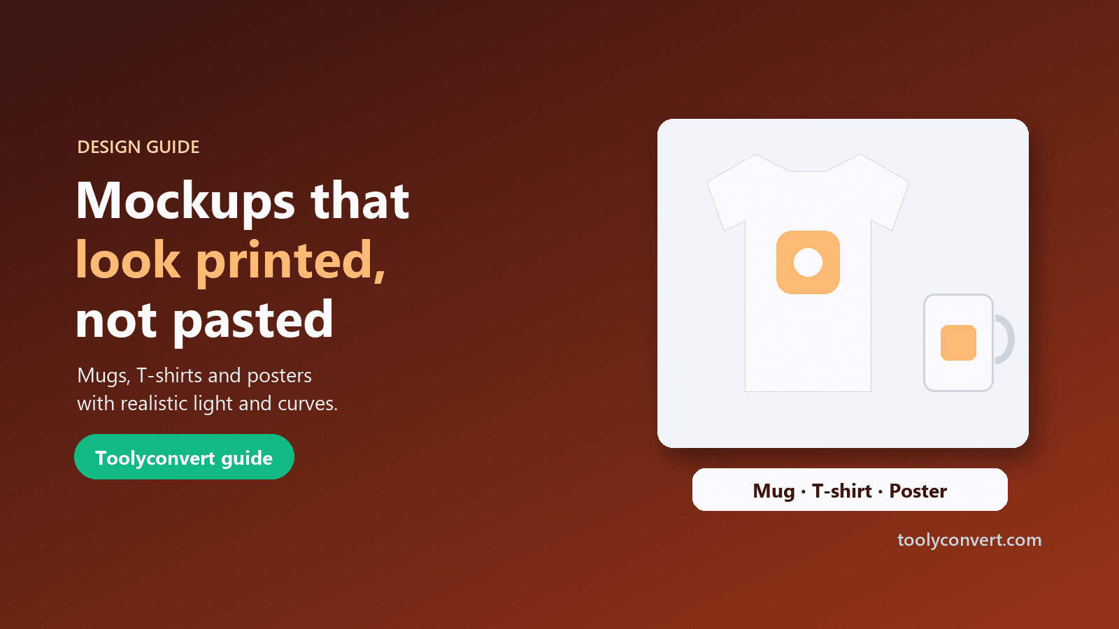
You have a logo, a slogan or a piece of artwork, and you want to show it on a mug, a T-shirt or a framed poster before anyone pays for printing. That picture is a mockup, and it does a lot of work: it sells print-on-demand products that do not exist yet, it shows a client what their new brand will look like, and it fills a portfolio with real-world context.
The difference between a convincing mockup and an amateur one is rarely the product photo. It is whether the design looks printed on the surface or stuck on top of it. This guide explains how to get the printed look, step by step, with the free Image Mockup Editor.
What makes a mockup look real
When ink goes onto a real object, three things happen that a flat image pasted on top does not do:
- It follows the shape. A mug is a cylinder, so a logo printed on it curves away at the edges. A poster photographed at an angle is a trapezoid, not a rectangle.
- It takes on the light. Folds in a T-shirt create shadows across the print. The shine on a ceramic mug runs over the logo too.
- It takes on the texture. Fabric weave shows through screen-printed ink; paper grain shows through a poster.
A design that ignores these looks like a sticker. The tools in a mockup editor exist to recreate them: warping for shape, blend modes and lighting for light, and texture for surface.
Prepare your design first
Ten minutes spent on the design file saves an hour of fiddling later.
- Use a transparent background. A logo saved as a JPG with a white box around it will show that box on a coloured T-shirt. If your design has a background, remove it first with the Background Remover, or let the mockup editor remove it automatically when you add an opaque design. See our guide on removing a background cleanly for edge tips.
- Use enough resolution. A design 1,000 pixels or wider keeps edges crisp on a full-size export.
- Think about the product colour. Dark text disappears on a black shirt; thin light lines vanish on a white mug. Prepare a light and a dark version if you sell both.
- Keep fine detail realistic. Very thin lines and tiny text often do not survive real printing, especially on fabric. If they look fragile in the mockup, they will look worse in print.
Choose the product photo
The Image Mockup Editor includes six templates: a white mug, a coffee cup, a white T-shirt, a tote bag, a phone case and a poster frame. On these templates your design lands on the print area automatically, keeps its proportions and gets the right warp and surface for the product.
You can also upload your own product photo. Good product photos for mockups have:
- Even, soft light, so the design can pick up gentle shading rather than harsh highlights.
- A front-on or slightly angled view, which is easier to match than a steep angle.
- A plain area where the print goes, without busy patterns, labels or heavy wrinkles.
Place the print area, curve and perspective
After adding your design, set where and how it sits on the product.
Print area mask. The mask clips the design to the printable region. Rectangle and rounded masks suit mugs, shirts and phone cases; polygon and freeform masks handle packaging and odd shapes. In "Edit Print Area" mode, drag inside the area to move it and drag the handles to reshape it.
Warp. Choose how the design bends:
| Warp | Use it for | What it does |
|---|---|---|
| Flat | Shirts photographed straight on, tote bags | Keeps the design flat inside the print area |
| Perspective | Posters, boxes, screens at an angle | Drag four corners to match the surface |
| Curved (mug) | Mugs, cups, bottles | Wraps the design around a cylinder |
For a mug, start with the curved warp and adjust the curve slider until the left and right edges of the logo seem to turn away from you. For a poster at an angle, drag each corner to the corner of the frame's inner edge.
Product presets. If you use your own photo, the T-shirt, Mug, Poster, Phone, Laptop and Packaging presets set a sensible print area, warp and surface in one click, keeping your design's proportions.
Make it blend with the light
This step turns "pasted" into "printed".
Surface presets. Realistic Print, Soft Print, Glossy, Matte, Fabric and Sticker each set a combination of blend mode, opacity and lighting. Fabric suits shirts and bags, Glossy suits phone cases and posters behind glass, Matte suits ceramic.
Blend mode. Multiply is the workhorse for printing on light products: it darkens the design wherever the product is darker, so folds and shadows show through the ink. Screen does the opposite, for light designs on dark products. Normal keeps the design exactly as it is, which looks like a sticker, and that is sometimes what you want.
Opacity, fade and feather. A touch below 100 percent opacity lets the material show through. A small feather softens the print's edge so it does not look cut with scissors.
Shadow and highlight. These sliders control how strongly the product's own shading and shine appear on top of the design. Raise shadow for wrinkled fabric; raise highlight for glossy ceramic.
Texture and colour. Fabric, paper, canvas or noise textures add the surface grain. Brightness, contrast, saturation and temperature help the design match the photo's colour cast, for example warming a design placed in a photo taken under indoor light.
A good test: zoom out until the mockup is the size of a thumbnail. If the design still looks like a separate layer, lower the opacity a little, add shadow, or switch to Multiply.
Export and use your mockup
When it looks right, export at full resolution as PNG, JPG or WebP. PNG keeps the most detail; JPG and WebP are smaller for websites and marketplaces. There is no watermark.
Common destinations need different sizes. Marketplace listings often want large square images, social posts work best at their platform's preferred sizes, and websites benefit from smaller files. The Social Media Image Resizer crops to platform sizes, and the Image Compressor shrinks files for faster pages.
If you are building a website before the real product photos exist, our guide to placeholder images for mockups and development covers stand-in images for layouts.
Common mockup mistakes
A white box around the logo. The design has a background. Remove it, or use a PNG with transparency.
The design is stretched. Designs should keep their proportions. If you resized the print area by hand, reset it or re-apply the product preset.
It looks flat on a mug. Use the curved warp and add a little highlight so the shine crosses the print.
It looks too perfect on a shirt. Use the Fabric preset, Multiply blend and a little shadow so the folds show through.
Colours look off. Adjust temperature and saturation to match the product photo's light.
Showing details that will not print. Hairline strokes and tiny text may look fine in a mockup but fail on fabric. Mockups should set honest expectations.
Frequently asked questions
Can I sell products using these mockups?
You can use your exports in listings. Make sure you own or have rights to the design you place, and to any product photo you upload yourself.
Do I need design software?
No. Everything happens in your browser, and your images are not uploaded. Only the optional background removal uses our server, which deletes the image straight after.
Why does my design look different in print?
Screens show light; print uses ink on a material. Expect colours to shift, especially on fabric. Ask your printer for a physical sample before a large order.
Can I put more than one design on a product?
Yes. Add more design layers, and hide, lock, reorder or duplicate them in the layer panel.
A convincing mockup is about respect for the real object: its shape, its light and its texture. Start with a clean transparent design, pick the right warp, let the product's shading show through with Multiply, and check the result at thumbnail size. Open the Image Mockup Editor and try your design on a mug first; it shows every one of these effects at once.